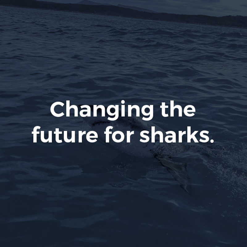
Shark Angels Rebrand – A Lifestyle Brand with Purpose
Shark Angels has always been more than just a non-profit—it’s a movement, a global community of passionate advocates for sharks and ocean conservation. This rebrand was about elevating the organization into a lifestyle brand that people not only support but actively want to be part of.
A Brand for Everyone
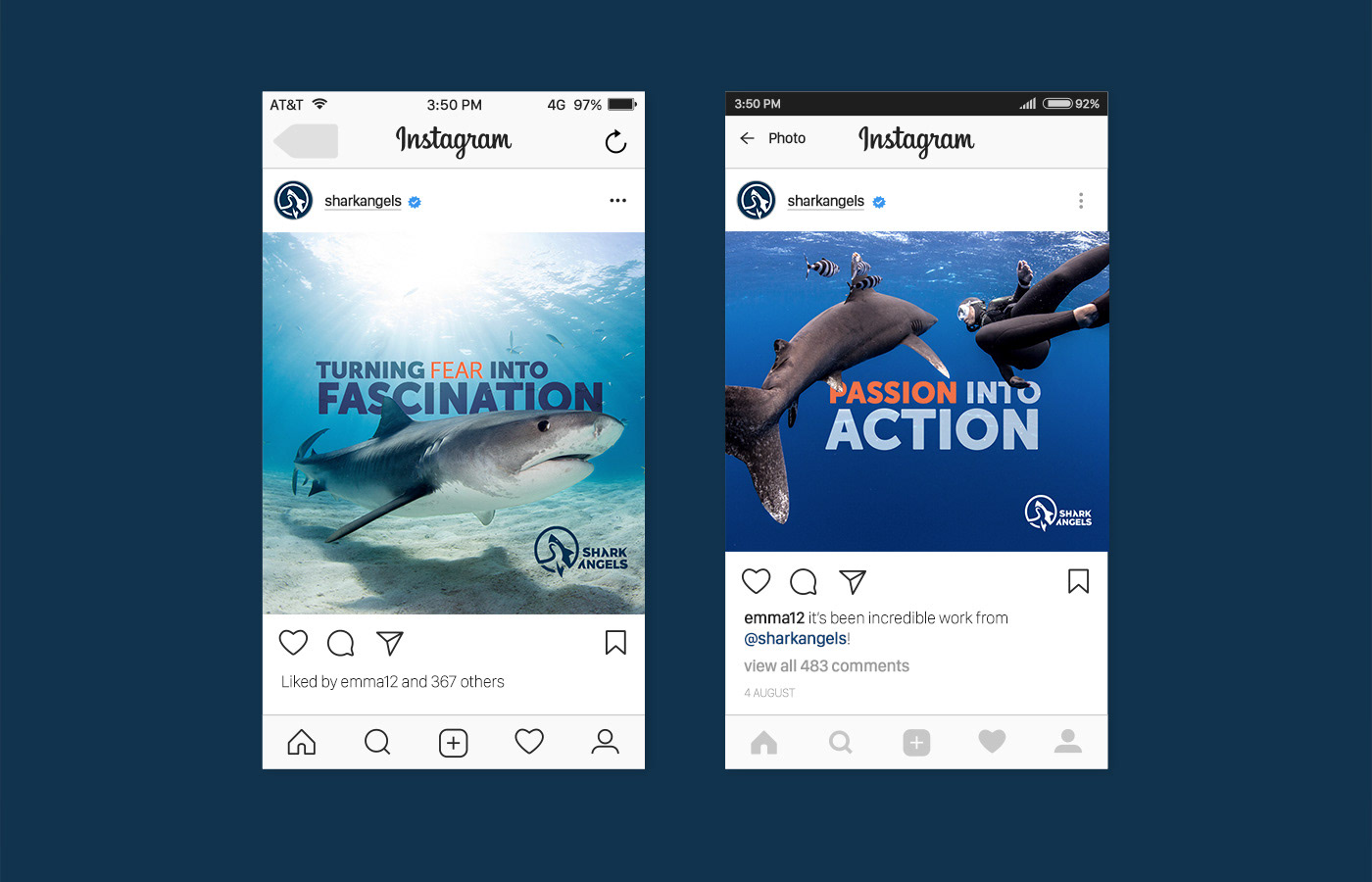
The goal was to create an identity that is inclusive, inspiring, and bold—one that connects with ocean lovers, conservationists, and adventure seekers alike. The new visual identity embodies a sense of purpose while remaining accessible and aspirational.
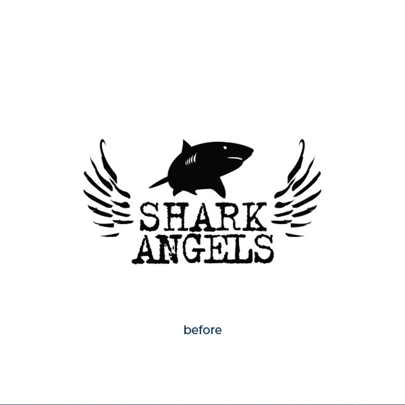
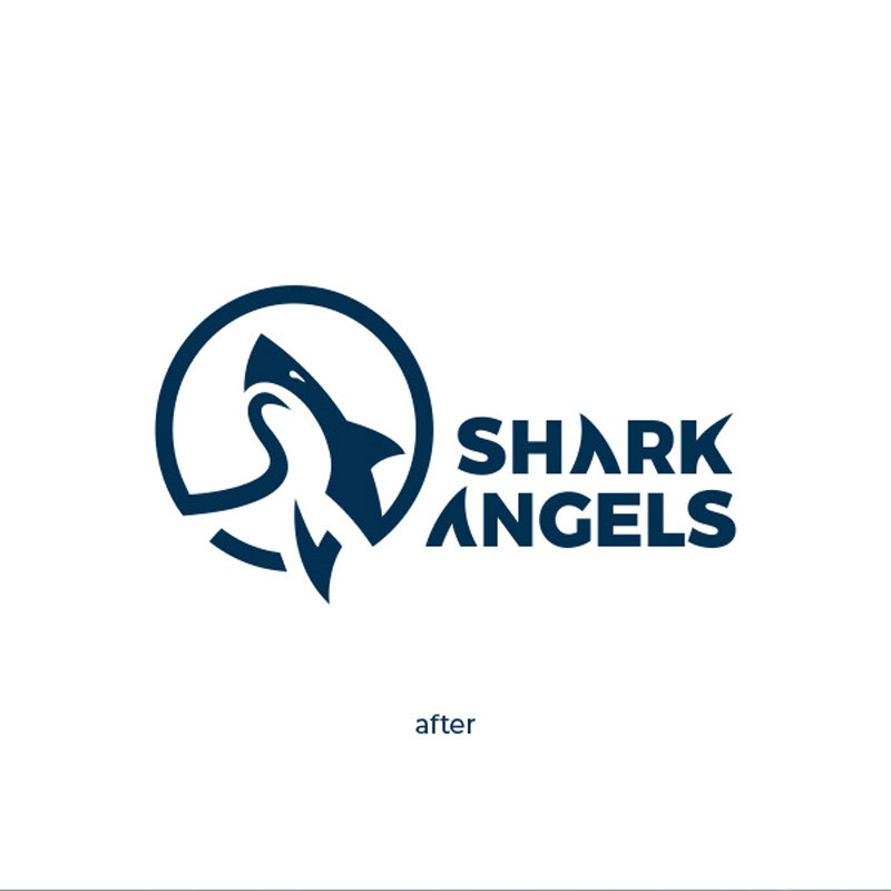
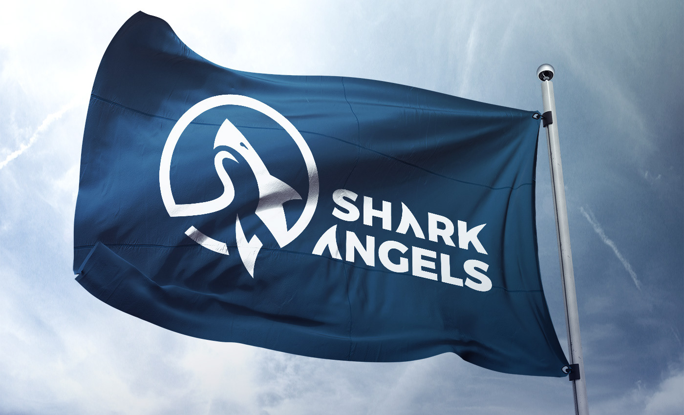
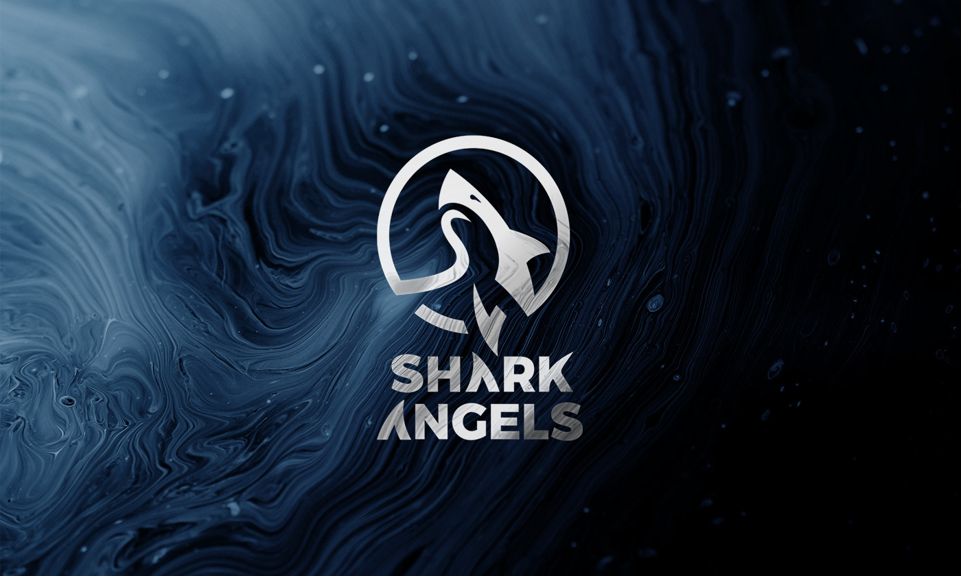
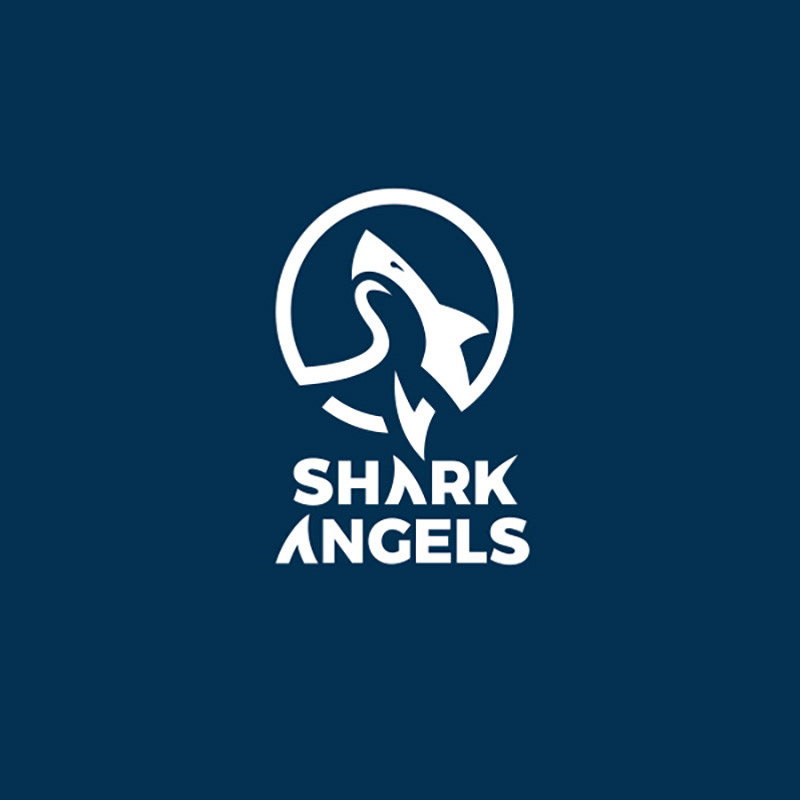
The Logo Evolution
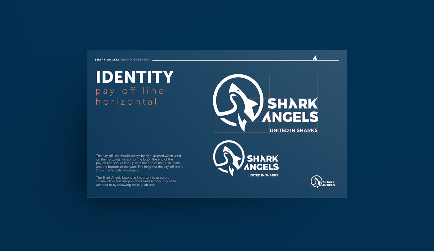
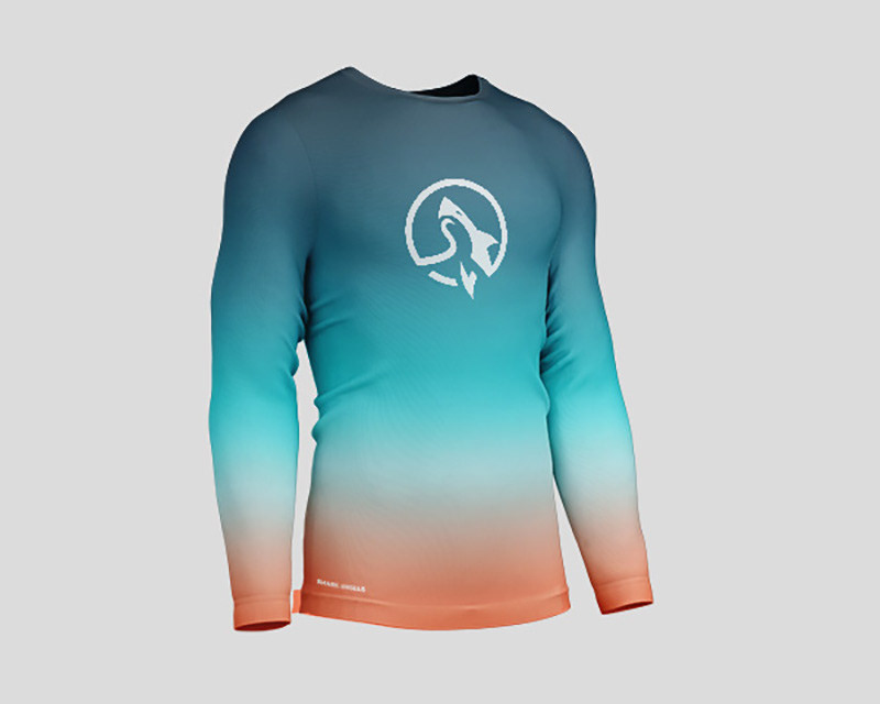
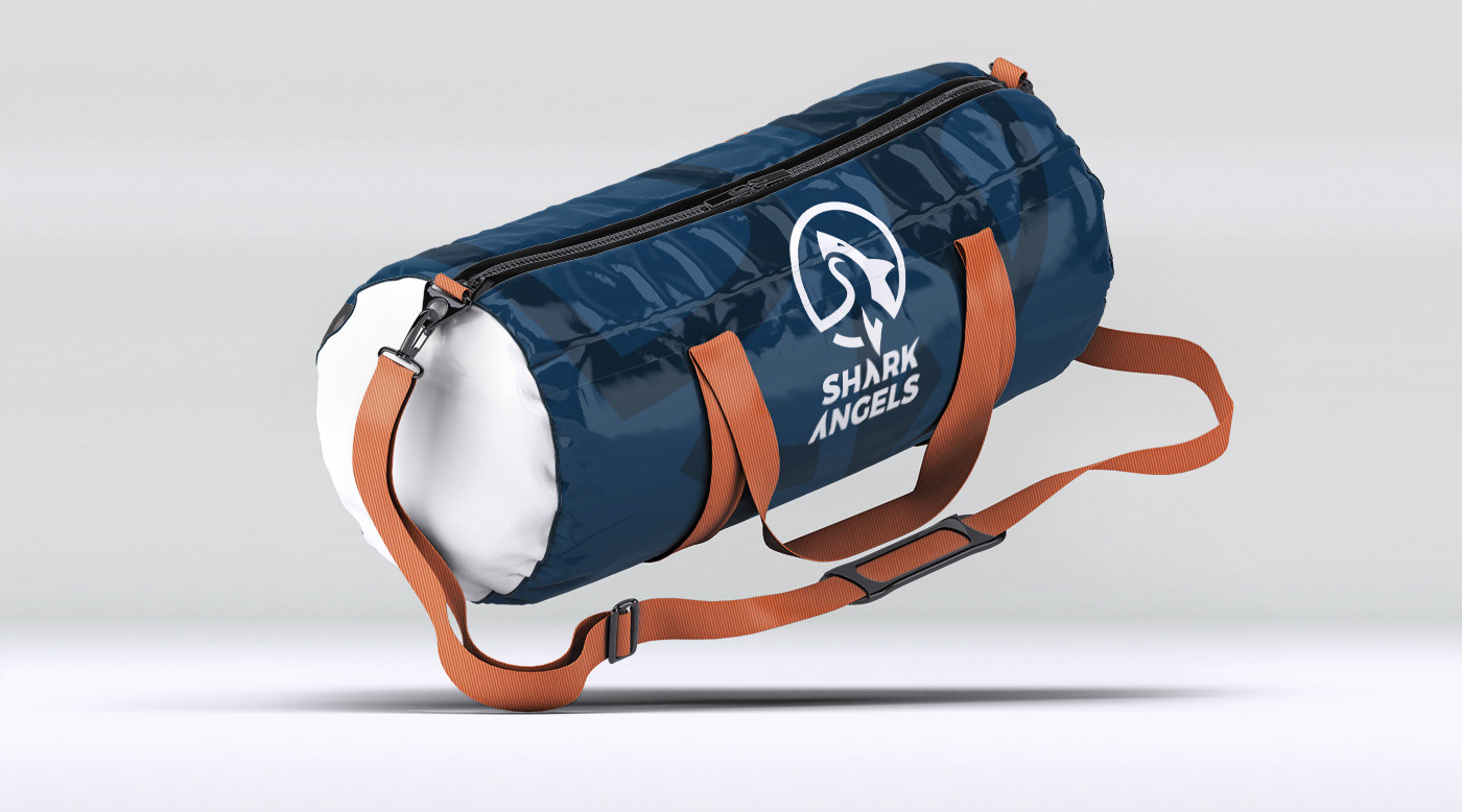
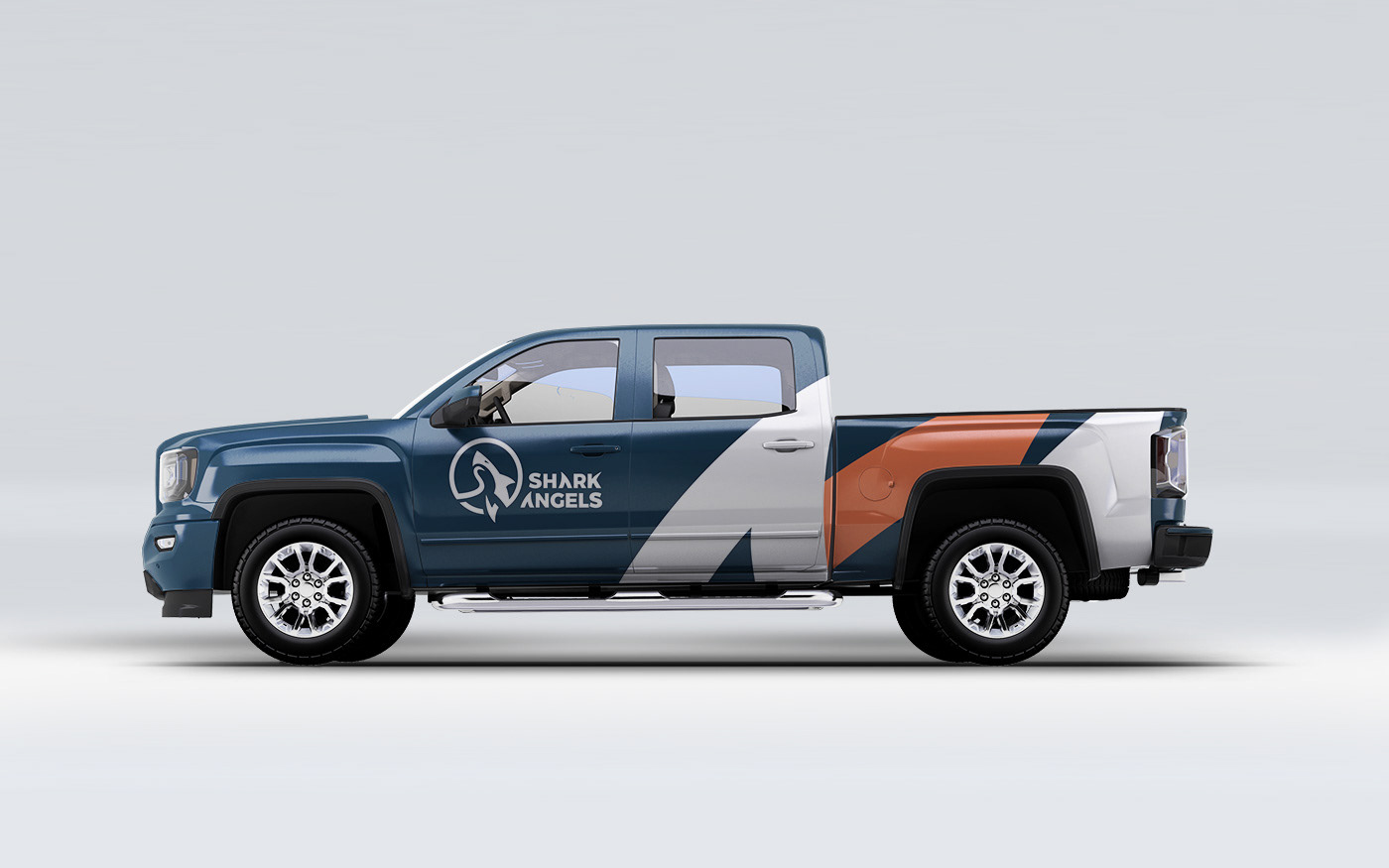
At the heart of the rebrand is a powerful new logo, seamlessly merging the “S” and “A” into the shape of a breaching shark. Encompassed by a circle, it symbolizes protection, unity, and the cycle of life in the ocean. This emblem reinforces the organization’s mission: to educate, advocate, and protect.
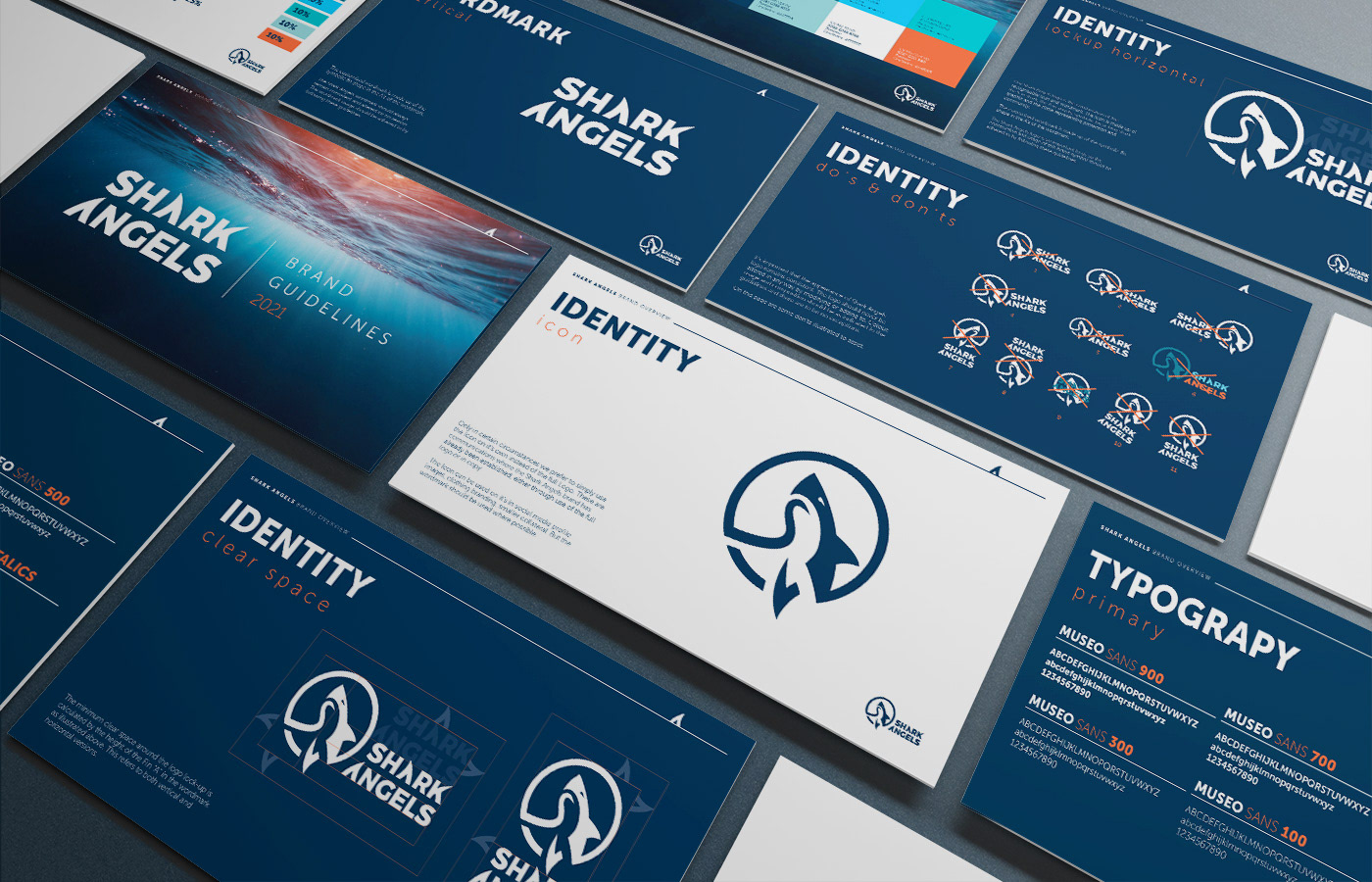
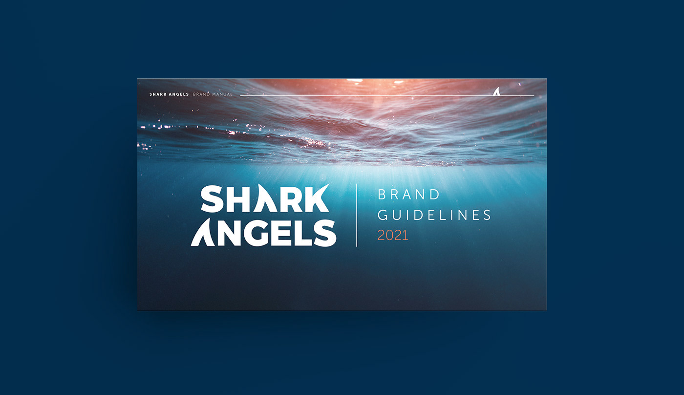
A Color Story from Land to Sea
The color palette is inspired by the natural world, transitioning from warm earth tones to deep ocean blues. This gradient reflects the connection between land and sea, emphasizing the importance of holistic conservation efforts.
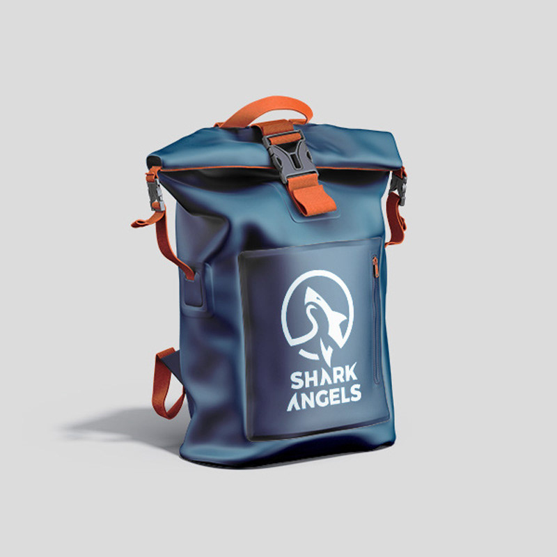
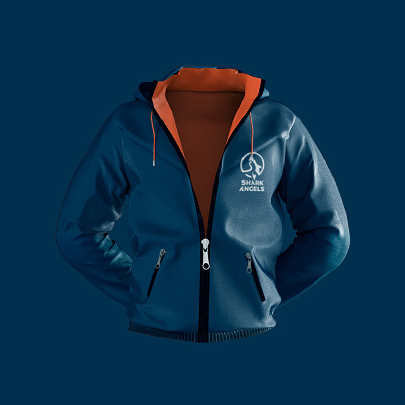
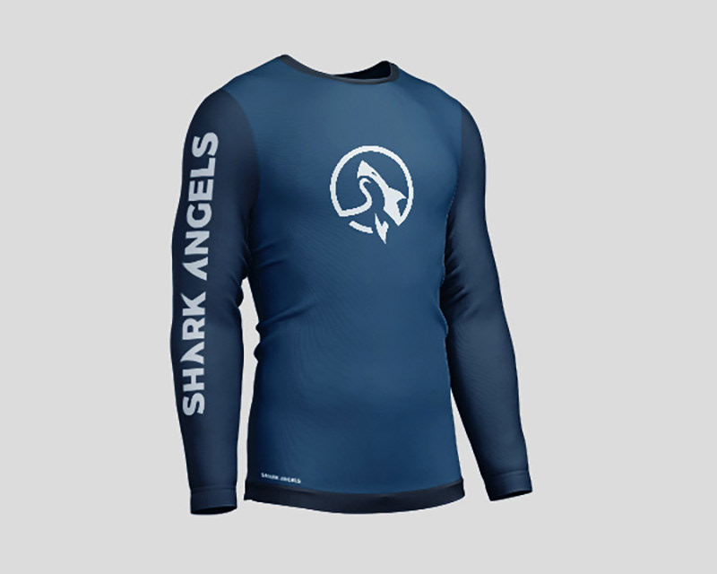
A Lifestyle Brand with Impact
Beyond a traditional non-profit identity, the rebrand positions Shark Angels as a movement-driven lifestyle brand. Whether through merchandise, social campaigns, or community engagement, the new identity invites people to embody the mission, making shark and ocean conservation a part of their everyday lives.
This rebrand is more than just a visual transformation—it’s a call to action, a symbol of belonging, and a commitment to protecting the ocean’s most misunderstood guardians.